
Describing layout
Learn how to describe the layout of a website, including practicing techniques to effectively communicate design elements and structure.

Part 1
Warm-up
Answer the questions
What did we discuss in the last lesson?
What is the layout of website?
Answer
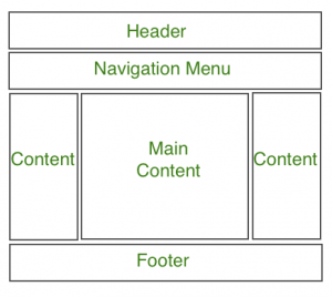
The layout of a website organizes visual elements like text, images, and buttons into sections such as the header, navigation bar, main content, sidebar, and footer to enhance usability and aesthetics.
Part 2
Vocabulary
Read the word, its’ meaning, and the examples
Then make up your own sentences using the word.
Student can skip the words they already know.
header
/ˈhed.ər/
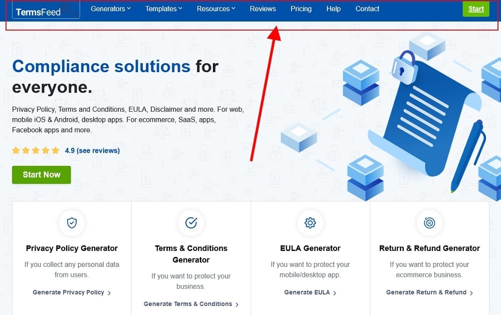
Top section of a website, often containing the logo and main navigation.
A sticky header remains visible as you scroll down.
Headers often include contact information and social media icons.
navigation bar
/ˌnævɪˈɡeɪʃən bɑr/
A set of links used to navigate different pages of a website.
The navigation bar helps users find sections quickly.
A vertical navigation bar is on the side of the page.
main content area
/meɪn ˈkɒntent ˈeriə/
The central part of a webpage where the main information is displayed.
Articles and news are in the main content area.
Keep the main content area clean and organized.
footer
/ˈfʊtər/
The bottom part of a webpage, often containing additional links and information.
The footer has copyright information and a disclaimer.
Footers can also include links to privacy policies.
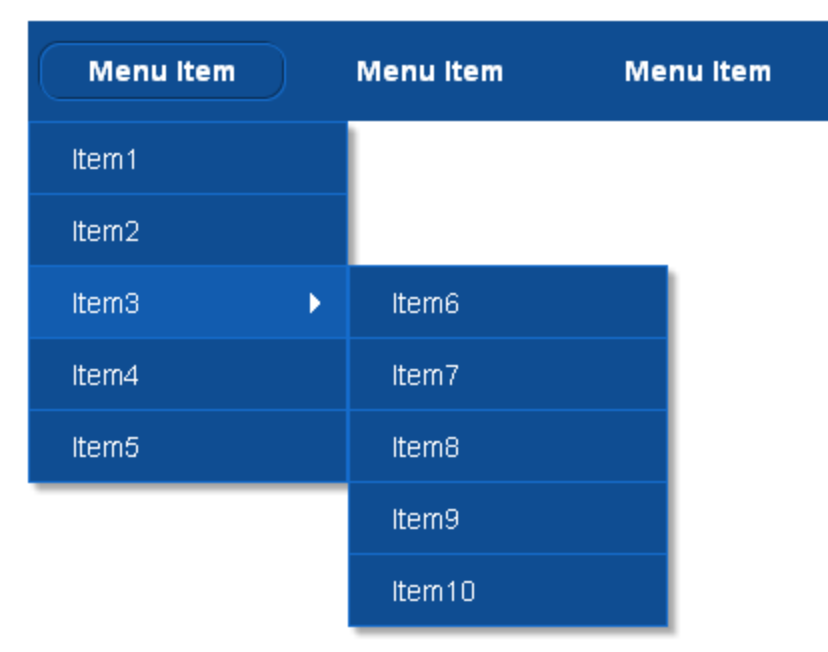
dropdown menu
/ˈdrɑpˌdaʊn ˈmenjuː/

A menu that expands to show additional options when clicked.
Dropdown menus are useful for categorizing related items.
Dropdown menus make it easy to keep a site uncluttered.
widget
/ˈwɪʤɪt/

A small application or component on a website with specific functionality.
A weather widget can show today’s forecast.
Many blogs have a search widget in the sidebar.
side bar
/ˈsaɪdˌbɑr/
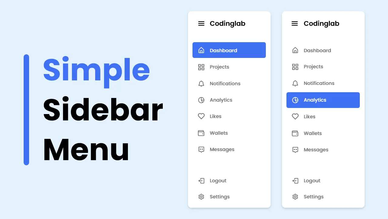
A vertical column on a webpage, used for additional navigation or information.
Some websites use a sidebar for advertising.
A sidebar can also host interactive widgets.
responsive
/rɪˈspɑːn.sɪv/
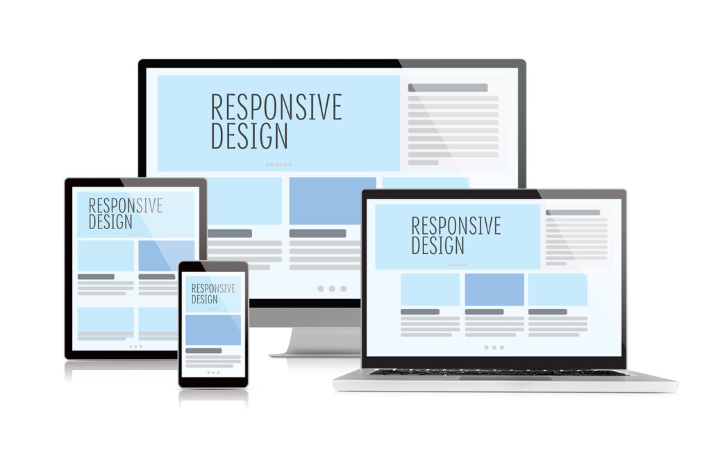
Describes a website design that adjusts to fit different screen sizes.
A responsive website looks good on both mobiles and desktops.
Responsive design improves user experience.
accentuate
/ækˈsentʃueɪt/
to emphasize a particular feature of something or to make something more noticeable
Use color to accentuate important buttons.
Accentuate special offers on the homepage.
Make up your own sentences using the words.
Part 3
Reading comprehension
Discussion & read the article.
Teacher helps student correct their pronunciation.
How would you describe the layout of a website?
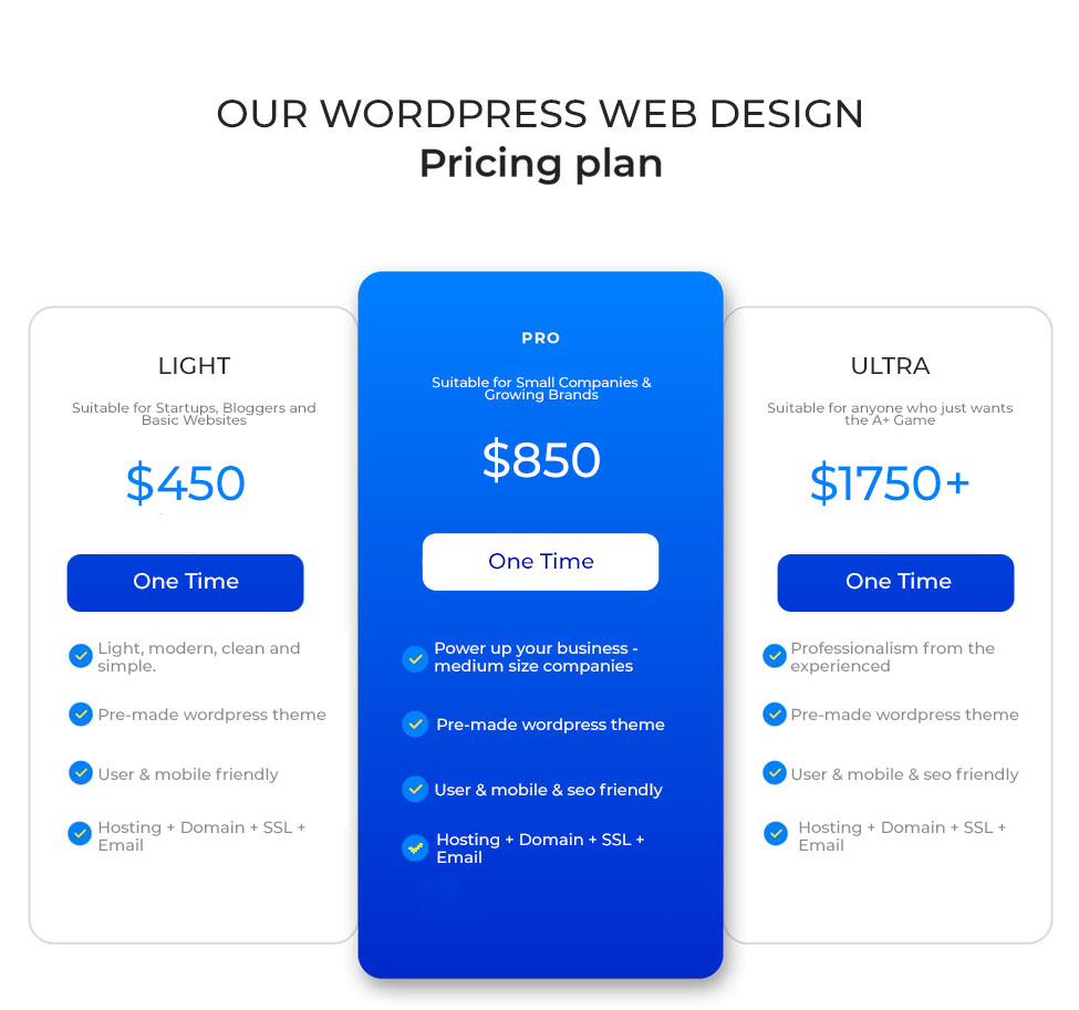
The website’s header is neatly organized, displaying the company logo and a navigation bar complete with dropdown menus for comprehensive browsing options. In the main content area, three subscription plans are presented in a streamlined, each accompanied by a unique widget summarizing price and features with a clear ‘Get Started’ prompt. Notably, the ‘Enterprise’ plan is accentuated with a darker widget background, suggesting a premium tier.
Beside the main content area, a sidebar potentially offers quick access to additional resources or functionalities. The website’s footer is thoughtfully laid out, providing contact details and other pertinent links in a discreet font. The entire site boasts a responsive design, ensuring that the layout adapts gracefully to different screen sizes, from desktops to mobile devices, for optimal user engagement and accessibility.
Part 4
Describe the layout
Teacher guides the student describe the layout of a website
To effectively describe a website’s layout, it’s crucial to detail each component systematically. Here’s a condensed guide to help you clearly outline the layout of a website:
- Header
- Logo position: Describe where the logo is placed (usually left, center, or right).
- Navigation bar: Note the presence of a navigation bar and any dropdown menus.
- Banner
- Features: Mention if there’s a prominent banner, its content, and any interactive elements.
- Main content area
- Layout: Describe the organization of the content (e.g., single column, multi-column, grid).
- Type of content: Mention the types of content presented (e.g., text, images, widgets).
- Special features: Highlight any distinctive elements like widgets that summarize information, pricing, etc.
- Sidebar
- Placement and content: Indicate the sidebar’s position (left, right, …) and its contents. (e.g., navigation links, social media links, event calendar).
- Footer
- Content details: List what the footer includes, such as contact information, additional links, disclaimers, or social media icons.
- Responsiveness
- Adaptability: Discuss how the website adapts to different devices (desktop, tablet, mobile).
- Overall design
- Color scheme and font choices: Describe the general color scheme and typographic style.
- User navigation: Assess how easy it is for a user to navigate through the site based on the layout design.
Example
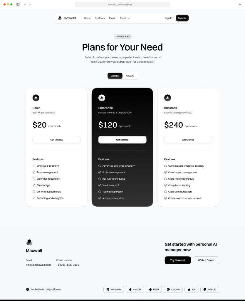
The website features a streamlined header with the company logo positioned on the left and a horizontal navigation bar with dropdown menus. A large, engaging banner dominates the view below the header, setting the tone for the site's promotions. The main content area is divided into three columns, offering a mix of news updates, featured products, and resource links. On the right, a sidebar provides quick access to social media and upcoming events. The footer is compact yet comprehensive, containing contact details and additional navigation. The entire site is responsive, ensuring a seamless transition between desktop and mobile viewing, maintaining high usability and aesthetic consistency
Now, open this website:
https://jeromelachaud.com/freelancer-theme/
and try to describe the layout of this.
Try one more website:
Part 5
Listening
Listen from the video, and choose the correct answer
Click to play the video
Where does the speaker say they plan to place the logo on their sample website layout?
- Top right
- Bottom left
- Top left
- Bottom right
Besides a title, what else does the speaker say will be included below the large image?
- A description
- Contact information
- A call-to-action
- Social media links
What will be placed below the testimonials according to the website layout?
- A footer
- A map
- Instagram photos
- A signup form
Besides sketching a layout by hand, what software does the speaker mention could also be used to create a website layout?
- Photoshop
- Illustrator
- InVision
- WordPress
What is the overall approach being recommended in the video for laying out a website design?
- Using stock photos and templates
- Hiring a developer
- Sketching it out on paper first
- Using website builders
Answer
- C - Top left
- C - A call-to-action
- A - A map
- A - Photoshop
- C - Sketching it out on paper first
Part 6
Discussion
Let’s use the vocabulary you’ve learned during the lesson and talk about the following topics/questions freely!
Teacher helps student expand and correct the answers
What makes a website layout good?
Should all websites have a navigation bar?
What should be included in a website’s footer?
How does the layout of a website impact your initial impression of a company or brand?
How does a website’s layout affect your ability to find information?
What is the purpose of having images on a website?
Do you prefer websites with lots of text or lots of images? Why?
How does a responsive design help users?
Review
Let’s review the lesson with teacher
9 new words in this lesson
Learn how to describe the layout
Practice about describing the layout of websites
See you next lesson
Homework
Do homework
Write a detailed essay describing the layout of your favorite website. Focus on elements like the header, navigation bar, main content area, sidebar, footer, and the overall design aesthetics.
